


Bootstrap is an Open Source JavaScript Framework. Bootstrap is a powerful front-end framework for fast and easy web development. It uses HTML, CSS and Javascript. The bootstrap was developed by Mark Otto and Jacob Thornton of the Twitter team. It was released on GitHub GitHub in August 2011 as an Open Source Project. Bootstrap is used more in creating a responsive website. Today we will learn what is Bootstrap, “Introduction to Bootstrap“, “History of Bootstrap“, “How to use Bootstrap“, “Features of Bootstrap“, “Advantage of Bootstrap“.
Perhaps, you may have asked the question, what is a responsive website? A responsive website means that it is a web design that adapts to any screen size, so it is as easy to use on mobile as it is on Tablet Tablet or Desktop.
What is Bootstrap?
Websites built in Bootstrap are more attractive and faster. Almost all types of websites are being built in Bootstrap today. If you are interested in web designing, this is a very important JavaScript framework for any web designer, which is used to design light weight and mobile friendly websites.
Do you want to be a successful web developer? Or want to make your website responsive? So learning bootstrap is very important for you, if you learn bootstrap, you can use it in website designing or development.
History of bootstrap
The bootstrap was developed by Mark Otto and Jacob Thornton of the Twitter company along with their team. Initially, they named it the Twitter blueprint, as they wanted to use it for Twitter, but they later released it as an open source project on GitHub on August 19, 2011 under the name Bootstrap. Anyone can use this framework for free on their website.
While there are many such frameworks available, Bootstrap is one of the most popular and most widely used frameworks among them. Bootstrap was the No. 1 project created on GitHub in June 2014, and today developers from all over the world use it to design responsive websites.
Bootstrap is created with the help of HTML, CSS and JavaScript, forms, buttons, tables, navigation, models, jumbotrons, dropdown menus, sliders, headers, footers, etc. can be easily created in Bootstrap. Bootstrap developers have created HTML elements, giving them CSS classes and using them are responsive and stylish and so you don’t have to do much work, you just have to use those built-in components.
How to use bootstrap?
As we read above, Bootstrap is an independent and open-source front-end development framework. It includes typography, forms, buttons, navigation and other components as well as HTML, CSS and JavaScript based website template designs. Therefore, bootstrap is very popular and has many advantages, you can use the bootstrap website template to create your website. A “bootstrap template” is used to create responsive websites, so it is important to learn how to use it.
You can use Bootstrap in 2 ways:
How to download bootstrap?
- Can download bootstrap.
- You can install bootstrap with CDN.
- First of all, you go to the official website of Bootstrap and click on the download button:
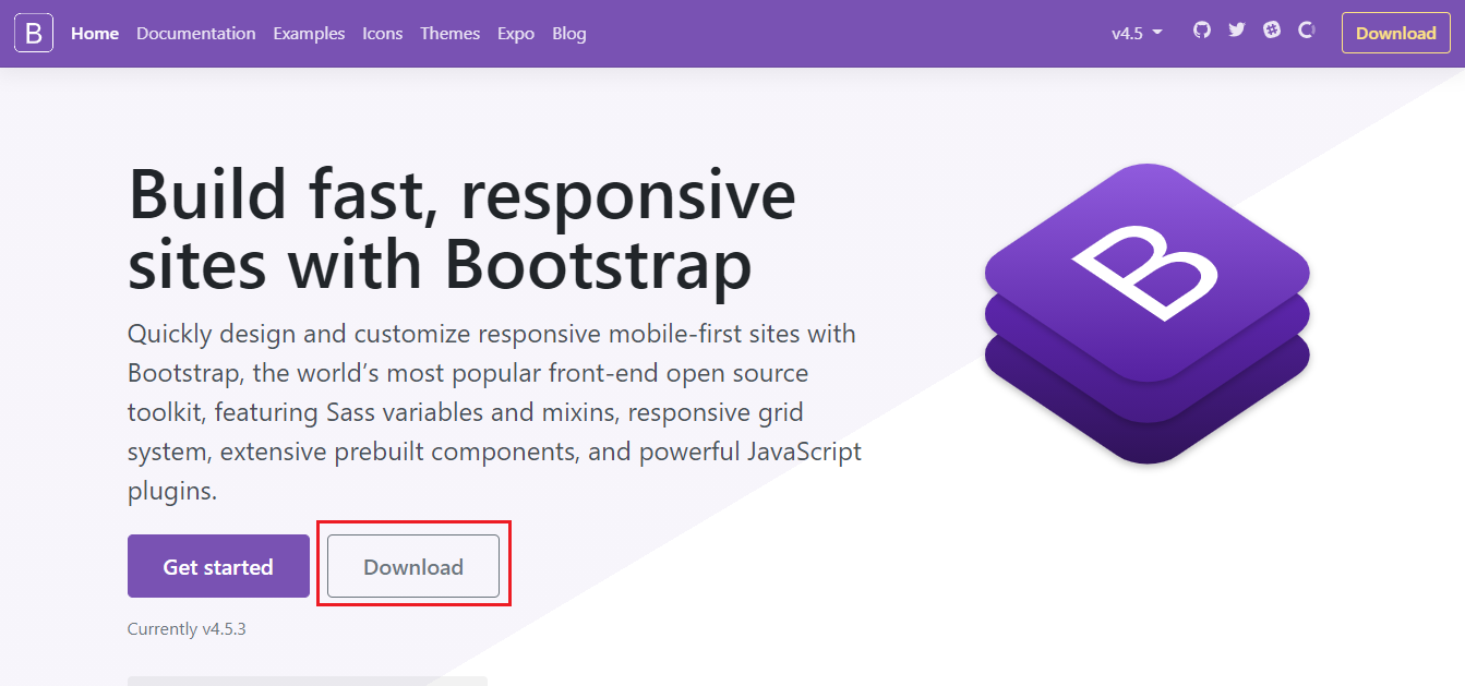
When you download bootstrap, you will get a zip file. Unzip it, you will find a folder containing three folders. You can install or link Bootstrap to your HTML online or offline:
CSS
JS
Fonts
You can copy and paste these three folders in the root folder (Public_html) of your website. After pasting in the root folder, you can link the CSS:
<link rel=”stylesheet” href=”css/bootstrap.css”>Similarly, you can also link a Javascript file:
<script src=”js/bootstrap.js” type=”text/javascript”></script>You have successfully installed Bootstrap in your website.
- If you do not want to download and host the bootstrap yourself, you can install it via the CDN (Content Delivery Network) method. MaxCDN provides CDN support for Bootstrap’s CSS and JavaScript.
 <!-- Latest compiled and minified CSS -->
<link rel="stylesheet" href="https://maxcdn.bootstrapcdn.com/bootstrap/3.4.0/css/bootstrap.min.css">

<!-- jQuery library -->
<script src="https://ajax.googleapis.com/ajax/libs/jquery/3.3.1/jquery.min.js"></script>

<!-- Latest compiled JavaScript -->
<script src="https://maxcdn.bootstrapcdn.com/bootstrap/3.4.0/js/bootstrap.min.js"></script>
Bootstrap features
- Open Source: The best thing about Bootstrap is that it is open source, you can use it for free.
- Easy to Use: If you have a basic understanding of HTML and CSS, you can easily use Bootstrap. Bootstrap is very easy and you can easily create a website using bootstrap components, just copy and paste it, ie using classes made from bootstrap.
- Responsive: The main purpose behind creating bootstrap was that people can easily create a good responsive website with its help. You can easily create a responsive website through bootstrap. Any website you create with Bootstrap will open easily on desktop, laptop, tablet, mobile, etc., your website will appear to fit exactly the device.
- Browser Compatibility: Bootstrap is designed in such a way that it supports almost all modern web browsers such as Google Chrome, Mozilla Firefox, Internet Explorer, Opera, etc.
- Customizable: If you want to change the in-built style of bootstrap, you can easily change it. For this you need to write your CSS code and overwrite the bootstrap code.
- Save Time: In the bootstrap framework, you get readymade code, which you just have to use in the right place, so you don’t need much coding if you have to change something. You do not need to use much HTML and CSS code and you save a lot of time.
- Support: Bootstrap updates from time to time, and each update brings a lot of new to the user and is hosted on GitHub. Currently, the host bootstrap on GitHub is expanded and protected with over 9000 contributors.
Benefits of bootstrap
- Bootstrap is an open source framework that you can use for free.
- Using a bootstrap template, you can create a responsive website very quickly, saving time, if you have to make some changes, you don’t need a lot of coding.
- This framework is very easy to use. If you know HTML and CSS then you can use Bootstrap.
- Using Bootstrap, you can easily create a responsive website. If your website is responsive, it adjusts according to the screen size in any platform or device.
- If you want to change the default style of a bootstrap template, you can easily do this using your custom CSS code. All you have to do is replace the in-built style CSS code with your CSS code.

